Goals
Halliburton sought to update its existing software services. Recent challenges in hiring STEM candidates and a rapidly aging and retiring senior technical staff that filled these positions created a need to evaluate the existing job and duties in order to find a new way to attract new applicants to these positions. At the same time, the need to standardize solutions across the organization was necessary to reduce the training and retraining of staff performing duties across the organization but on different software solutions.
This solution needed to bring novelty to the tasks, enable engineers to visualize and sell abstract ideas, and be usable by multiple language groups despite only an English release of the application.
The problem to solve
Since the inception of computing in the oil field, various engineers had created home-brewed solutions and 1-off’s to solve various problems and run machines and collect data across Halliburton and its subsidiary companies. These solutions were never duplicated or refined and often replicated in different forms by other engineers across the organization.
As engineers would move from job site to job site, they would often have to relearn their job, despite performing the exact same tasks as another job site due to the wide variation in software solutions deployed to perform these tasks. Engineers who did not create the applications would then have to learn how to use clunky and unrefined solutions created “in the moment” to solve a problem, but never refined into an actual product. As is common with these engineer solutions, little to no thought was put into making the process intuitive.
This problem was further compounded by the rate of retirement of these engineers and fewer and fewer people who knew how to use these applications.
Replacing these workers with the “Next Generation” of engineers was proving difficult as well. New graduates, who had been raised in the information and smart device age, were not willing to sit in trailers in remote locations looking at numbers pass by on spreadsheets. They were much more accustomed to interactive and visually driven data solutions. Almost as soon as a new candidate was hired, they would resign and seek employment in other fields.
It was our job to find a way to solve all of these challenges. Oh, and one more - the CEO of the company was a fan of TRON. Whatever solution we landed on, it needed to look like it came from the TRON universe.
The platform to build it on
This application was to be built in WPF and C# with C++ and Unity Gaming Engine interfacing. An XAML UI overlay and vector-based graphics and animations would render powerful equations and model virtually every aspect of petrochemical physics and chemistry processes.
Process
Like any project where I do not hold an SME level skill, I take the time to learn about the industry and the people who are in it. In this case, Oil & Gas, was a field where I knew little more than the results powered my car. In the first weeks of this engagement, I took the time to start identifying the various jobs we would be performing the services for and meeting the experts in those jobs who would inform the direction we went in.
At the same time, we were given a group of 25 users who would be our dedicated users for a 6-month period. These users would be replaced every 6 months with new users. At the end of this 6-month period, all engineers who would be the FUT users were brought to our location for training on the release candidate.
This process was repeated for 4.5 years while I was with the organization.
Interviews and information gathering
The application was divided into features, and our team of 6 UX personnel were given 2 features apiece to run. On top of this, I was selected to run the UX Scrum and head the team standardizing features as they were designed for the application suite. It was my job to look at new feature designs and compare them to the approved designs. If there were existing features or function that were already approved, it was my job to communicate to the designer the necessary changes or validate the reason for their derivations based on unique needs that the approved approach did not solve.
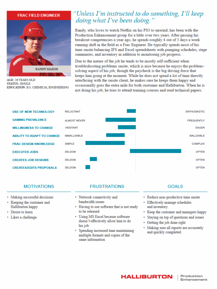
We needed to get to know our users and walk in their shoes. As we carved out features to build, we began to evaluate our workers and develop user personae to represent them as they journeyed through the application. These were used to tell stories that would inform our design and helped us communicate ideas up the stakeholder chain in a way that was meaningful to them.
| Example Engineer Personae |
|---|
|
|
 Each of our user types were used as models for designing tests and then communicating the results to the parties that needed to know. When discussing a particular journey through the application, we would invoke and consider their reactions.
 Identifying workflows and diagraming them
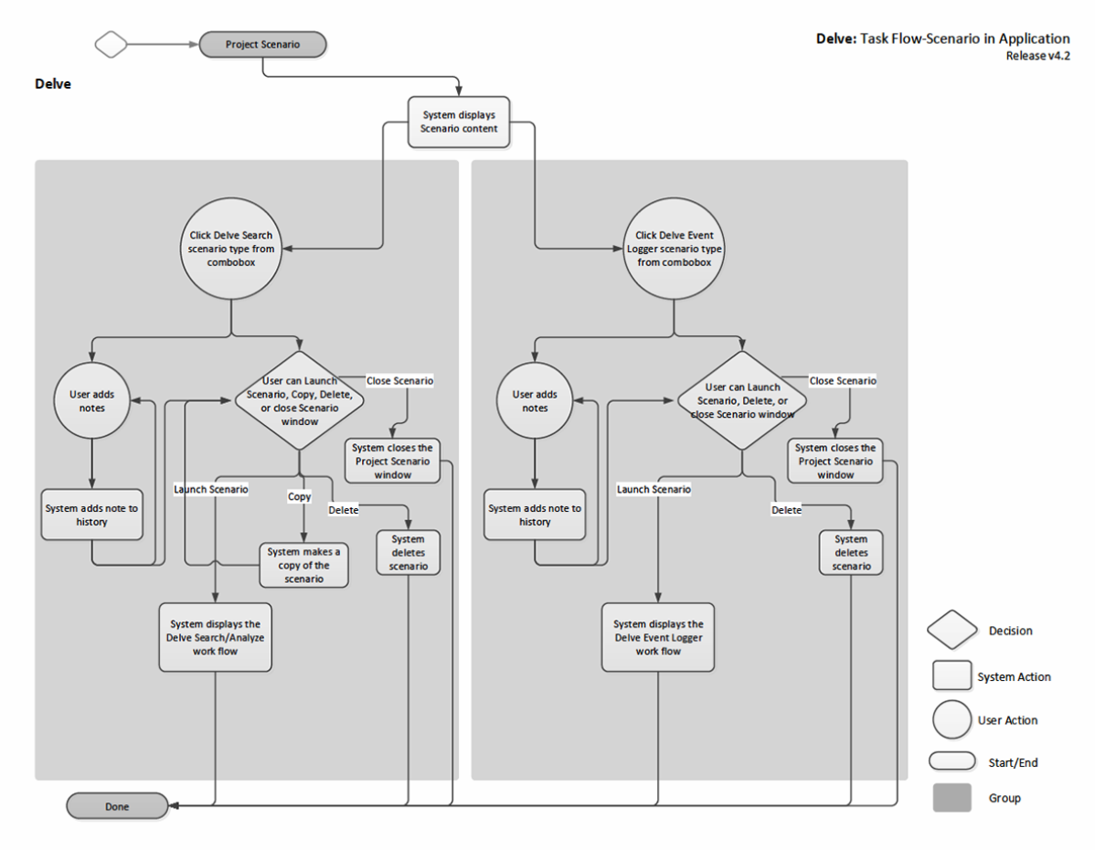
With so many overlapping and complex jobs and services being covered by this application, it became quickly clear that we needed to diagram this application fully and identify work flows and users of those flows. (Some of the results of this work are available in my Research section.)
As these flows were mapped, they were then presented to the stakeholders, application users and SMEs for input. Usually a couple of rounds of this work occurred before a task flow was approved for a feature. This process was repeated through the identification of MVP features that would be deployed on the first release. Additional work was done to look ahead at features that would be released later as the project progressed, when those duties or processes were shown to overlap with those that would make the first release of the application suite.
Analysing the existing software
In order to meet many of the goals of this project, I needed to understand what solutions were currently being used, what tasks they performed and what problems users were having with these applications. In many cases, I would speak to the very person who created the current solution and learned how to use the application.
I talked to the few new STEM candidates they were able to retain, and in some cases, observed them using these solutions and ask them to give me feedback in real time while they were using them. I also looked at the challenges that users in other language groups were having with existing solutions to look for easy wins and commonality amongst users.
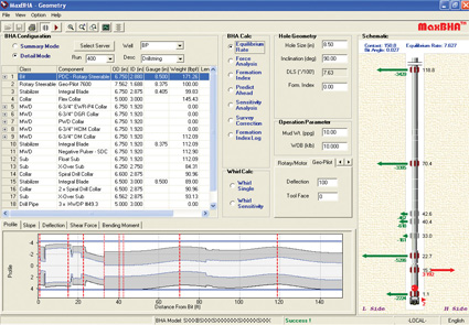
| BHA Fluid Editor (Fluid Simulation) | Device Tree (Wellbore) |
|---|---|
|
|
| Max BHA (Fluid Simulation) | Max Activity (Damage Monitor) |
|
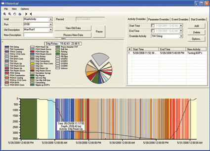
|
| Rock-It Performance (Chemistry Library) | Well-STIM (Wellbore) |
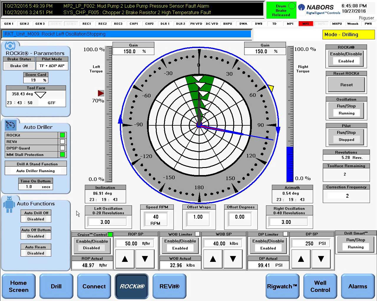
|
|
Once the challenges and objectives of the project were identified, it was time to move to the next phase.
Looking at the gaming industry for inspiration
Finding analogs in the gaming industry was one of our biggest challenges. In order to make this application successful and “gameified,” we needed to understand what made games successful at what they do.
One of the biggest successes of a video game is the playability across languages. Though some of the game is ported into various languages, key parts of it never change. This focuses around iconography and task progression and placement.
Games that centered around skill-building and data-visualization required the user to learn complex tasks, but often lacked any text cues or prompts. Instead, these games built upon the skills learned by gamers via other games to introduce them to the controls and information architecture of their game. The most successful of these game types were strategy games and MMORPG games.
We also took a look at successful TRON games (a mild joke, no TRON game was ever successful in the market place) for our design language and areas where we could borrow from its simplified data visualization in order to communicate information to our users.
| Tron Inspired Designs | Complex Gaming Screen Division |
|---|---|
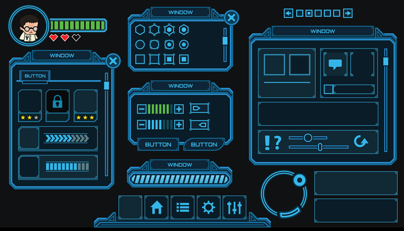
|
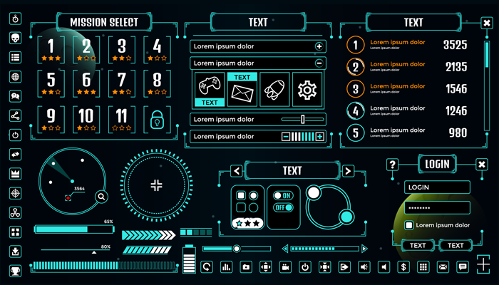
|
| Skill Builder Workflows | Icon Driven Activities |
|
|
White boarding with SMEs to identify solutions
After getting a grasp of what this project required and identifying approaches to meeting these goals, it was time to start brainstorming with SME’s and stakeholders to come up with designs that worked. We would first draw and discuss on white boards. Notes would be taken, changes would be made, and once an agreement was made, I would then start refining wireframes in their interactive prototype software known as Sketchflow - Expression Blend. This software allowed me to build functioning prototypes for testing and allowed the developers to use code and components created and tested by myself and our team.
These wireframes fed into prototypes which were used to validate solutions against our user testing group, which were then refined based on results.
Over time, this prototype was used as part of the documentation that met the ISO requirements.
Entering AGILE and creating user feedback loop to our backlog
The initial discovery phase of our project was more Waterfall than AGILE. This period was used to perform research and set up the environment and processes we would use going forward. Once this phase ended we then cut the work into backlog items and entered the Sprint Cycle.
It was during this period that release candidates were passed to our users and surveying and testing would occur.
The information we gathered would be presented to PO’s and stakeholders for evaluation. This would inform the product backlog and at times we would pivot and change designs based on this feedback. This process was repeated during the 4.5 years I was involved with the project.
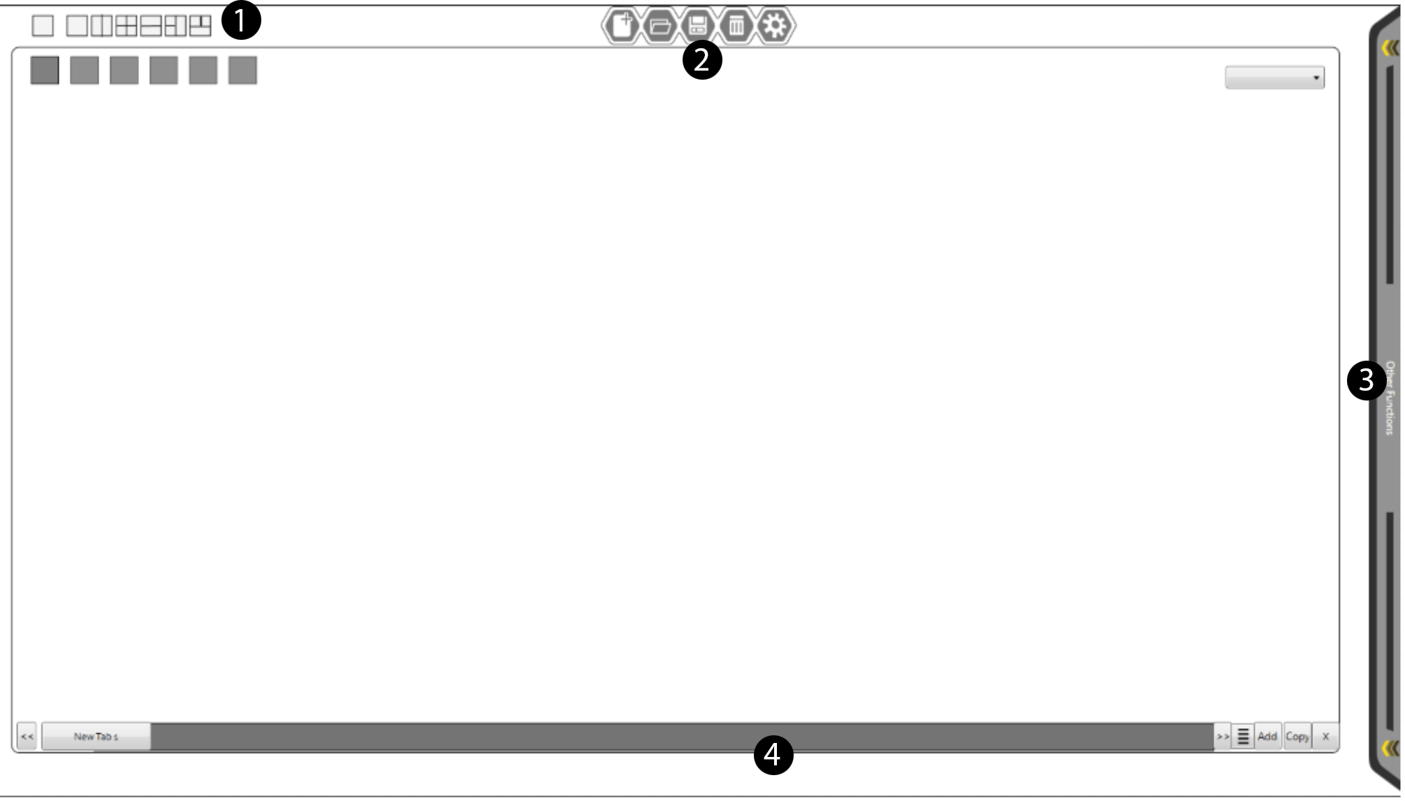
Application Consistency
I was also responsible for making sure that the software voice was consistent across all applications. All buttons, all error codes and all messaging needed to follow a consistent architecture.
This consistency enforcement extended to button and function placement.
| Consistent Information Architecture Across Workflows |
|---|
|
| 1. View Control | |
|---|---|
 |
Users of Knoesis required different views and sometimes even multiple views of the same project. Screen control and division was a key part of all workflows and located consistently for easy access. |
| 2. Main C.R.U.D Services | |
|---|---|
 |
All Activities that were shared across applications such as Creating, Reading, Using and Deletion or Management (C.R.U.D Services) were centrally located in all work flows. Users of one flow would be able to reach these common activities easily. |
| 3. Slide Menu's | |
|---|---|
 |
In most parts of the application, users would be required to access complex workflows within other workflows or prepare data to inject into a simulation on their screens. The need to show and hide these flows and make it obvious to users that there were hidden actions and resources offscreen, required consistent control design and iconography. The Slide Menu or Shelf Control was the answer to one of these problems. |
| 4. Timeline and Layer Controls |
|---|
 |
| Any application flows that required the user to create multiple comparisons or view time-based data were located at the bottom of the screen. In this view we see variations of fluids set up in Material Library for comparison. These fluids could be exported from here to other workflows and applications. |
Entering AGILE and creating user feedback loop to our backlog
I would meet weekly with all feature leads and we would discuss the upcoming challenges and hash out the designs we were presenting for the next sprint cycle. Once a decision was reached, it was my job to enforce consistency across the life of the project.
This was achieved through AGILE Scrum and documentation.
The initial discovery phase of our project was more Waterfall than AGILE. This period was used to perform research and set up the environment and processes we would use going forward. Once this phase ended, we then cut the work into backlog items and entered the Sprint Cycle.
It was during this period that release candidates were passed to our users and surveying and testing would occur.
The information we gathered would be presented to PO’s and stakeholders for evaluation. This would inform the product backlog and at times we would pivot and change designs based on this feedback. This process was repeated during the 4.5 years I was involved with the project.
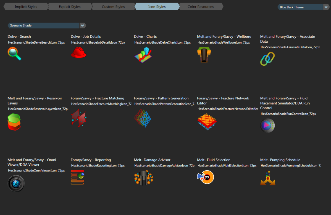
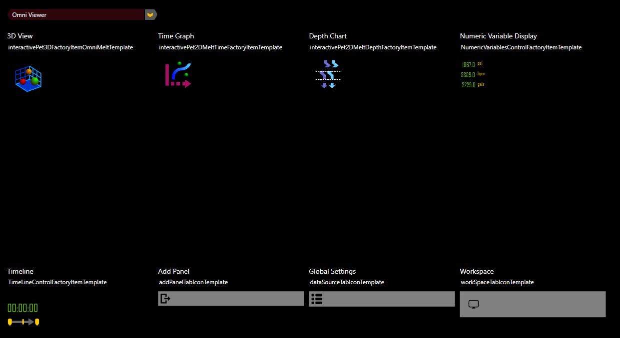
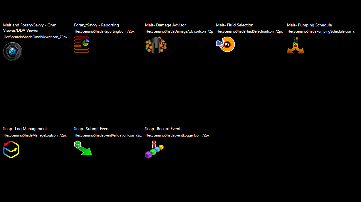
Building our symbol language library
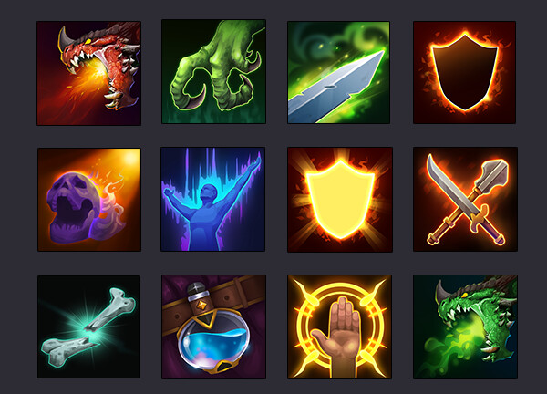
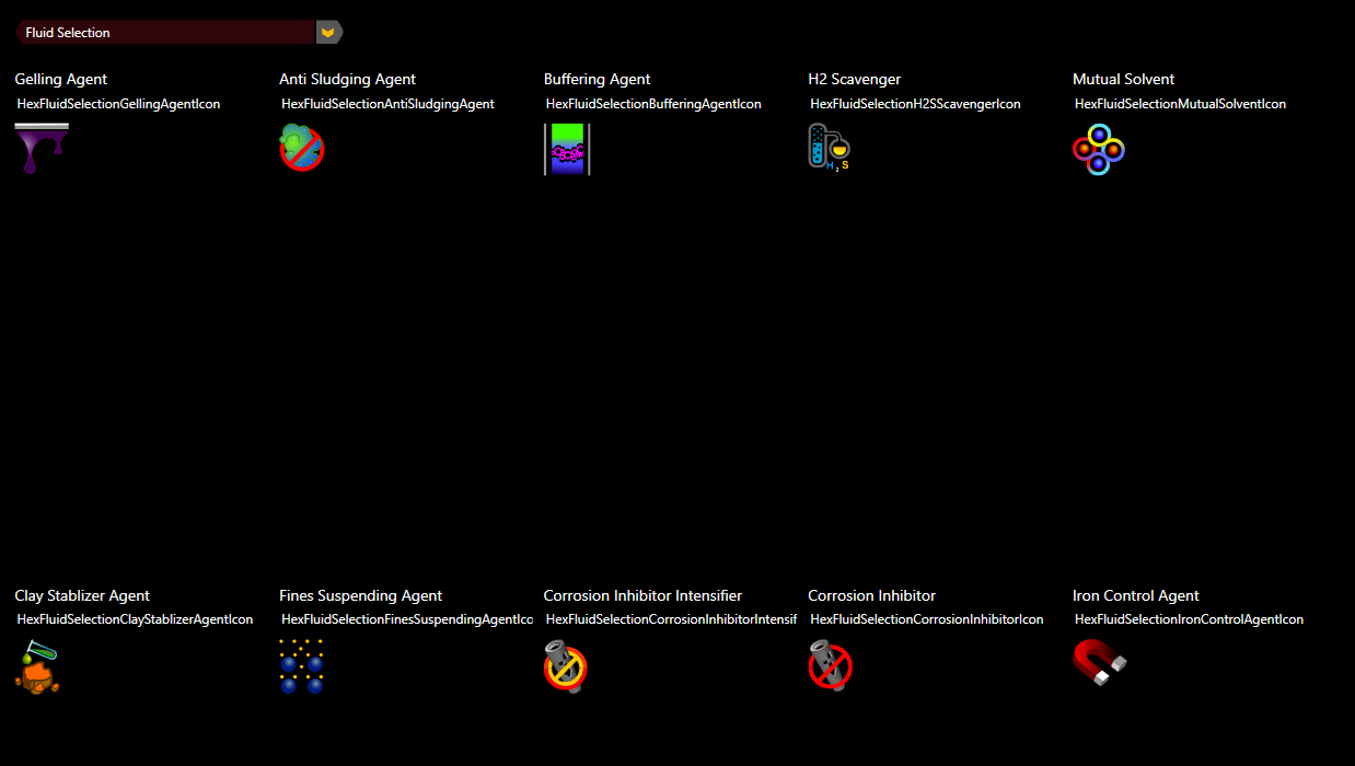
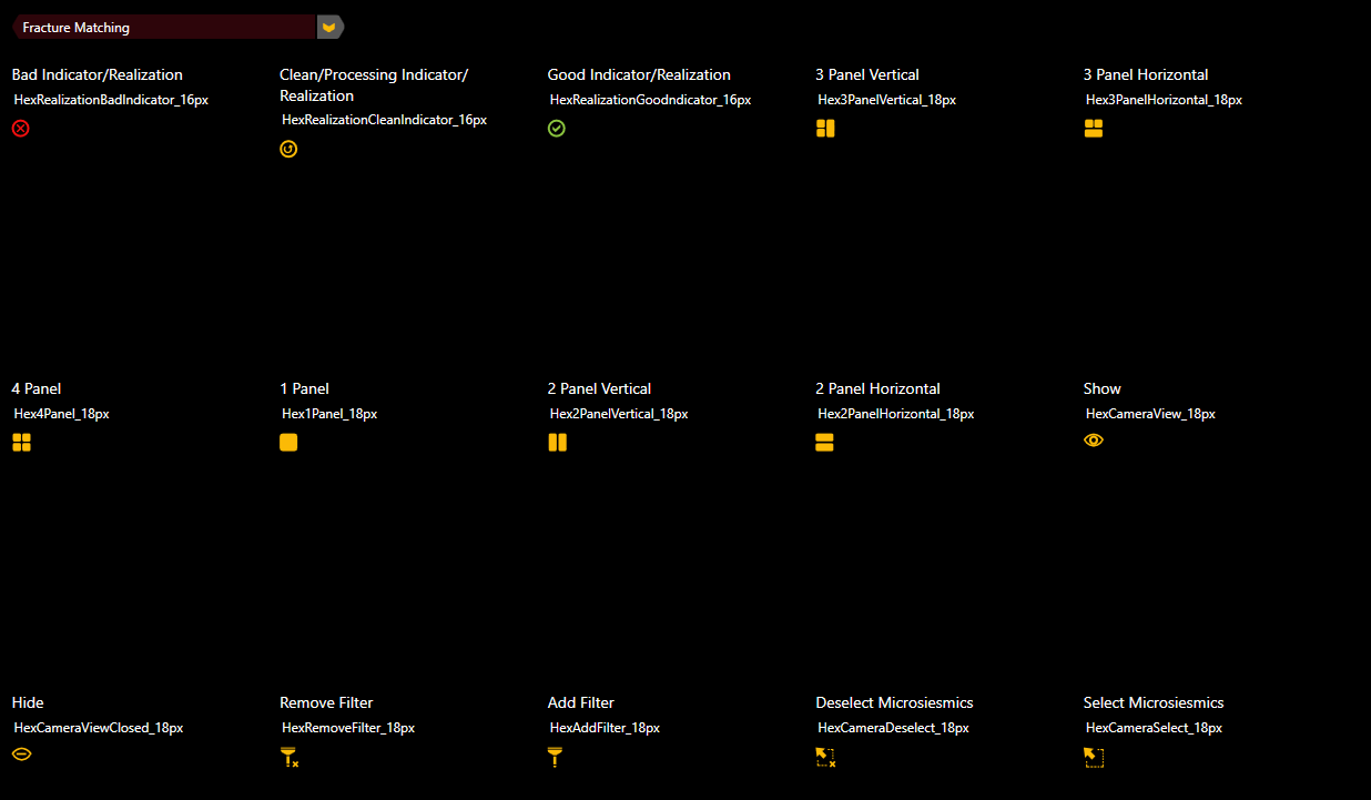
Our application was going to have to work for users who did not speak english. We would have to rely on symbols and icons almost exclusively to communicate our work flows. I was charged with creating this symbol library and then test and refine it on user groups across the globe. Over time, we were able to build a visual language library
Like the games we reviewed, our images and icons were taken from abstracts of the work flows users would engage within the application. Simplified versions of the tasks they would visually perform would guide them through their tasks. Also, relying on existing color messaging already understood within the Oil and Gas industry, we were further able to communicate valuable task and alert information to the user. Below are some samples of this library.
|
|
|
|
|
Workflows
In order to build our site, we needed to understand the tasks our users performed using our software, and what steps and variations occur in these work flows.
See Documentation below for detailed walk throughs and workflows for Knoesis
Screenshots
I had a big hand in user experience, visual design and coding of this project. Because I had familiarity with vector-based design in my Flash Background, and because I was familiar with XML and therefor XAMAL, plus my work with animation, made me quite useful in all steps of UI design and Development. Controls I build in my user testing were factored in by the Developers, as well as any animation sequences I built for the Application in WPF.
The screens below are designs I created after extensive user testing and design of work flows for the final Knoesis Application.
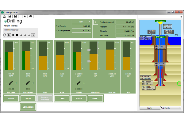
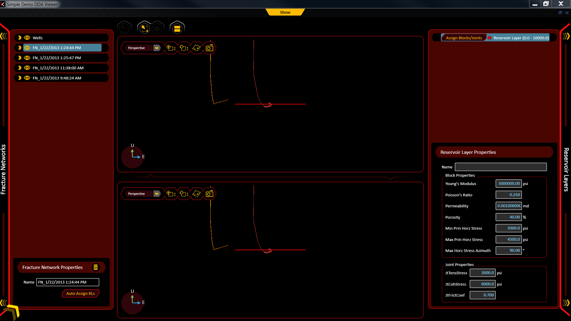
3D Fluid Simulator
Show the effects of fluids moving within a formation. Allow users to simulate fluid models or run demonstrations of real time events of fluids moving in a formation. This meant that engineers could use this virtual space to simulate a proposed chemical mixture and the resulting effects it would have while being pumped into the ground. Or, real data from the systems at an oilfield or platform site, could be converted into a visual simulation of the events taking place in real time.
Users would be able to add and remove objects, surfaces fluids and formations of rock to demonstrate various datapoints or monitor sensors along the drilling site.
This project was an early IoT attempt by Halliburton.
| Playing Fluid Simulation Data Back | Interacting with Data Touchpoints |
|---|---|
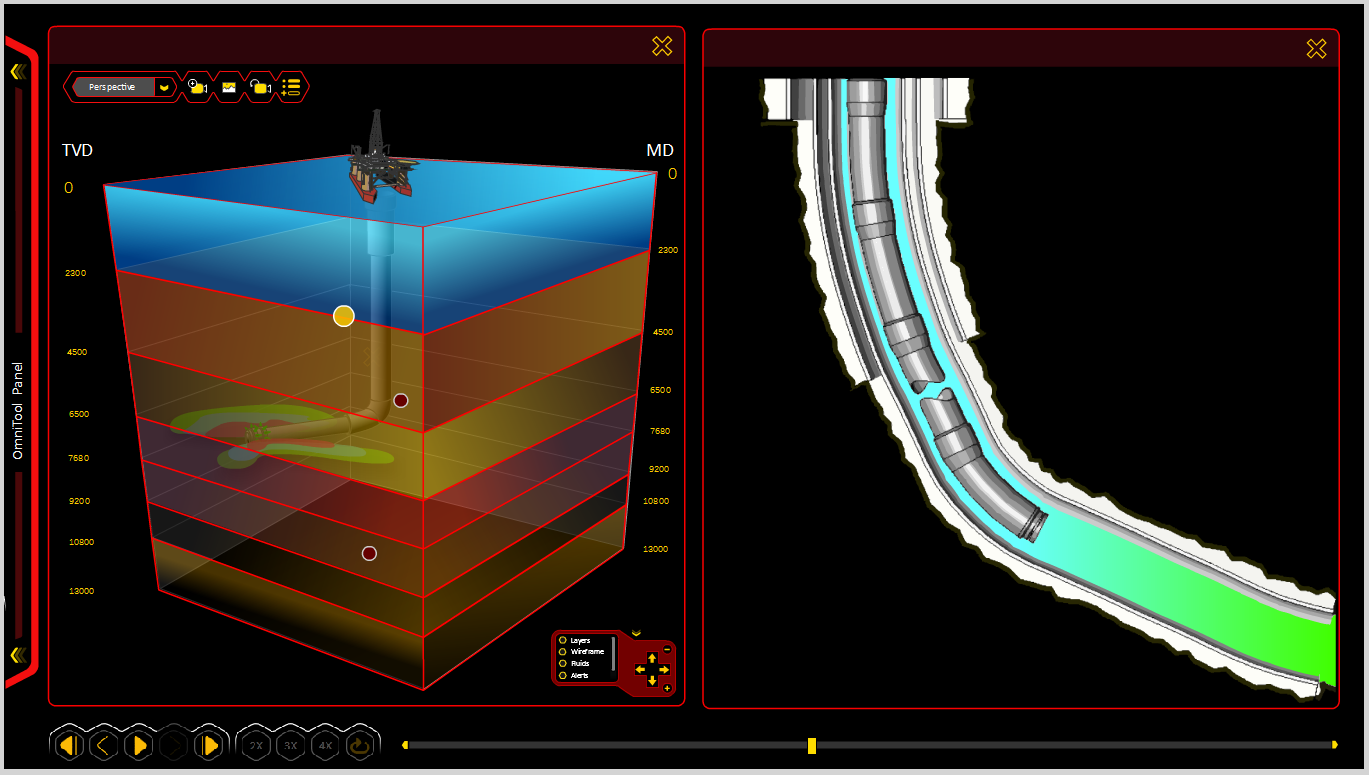
|
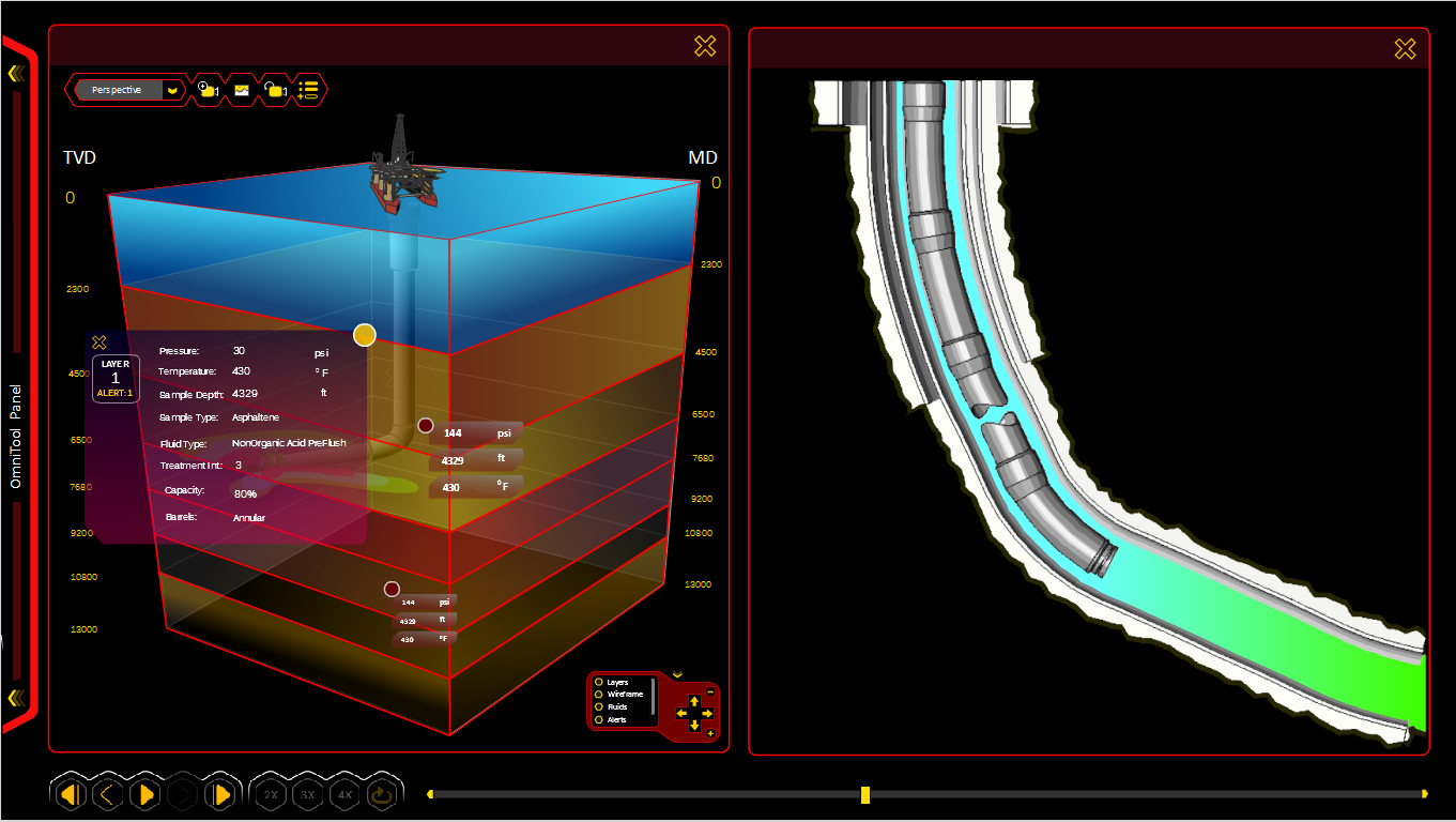
|
| Layers Removed During Playback | Skeleton View of Well Site |
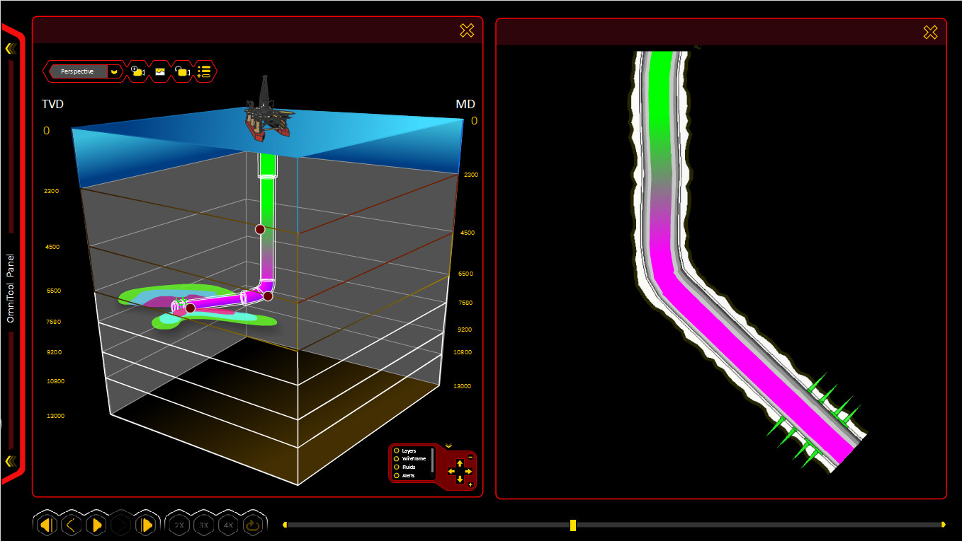
|
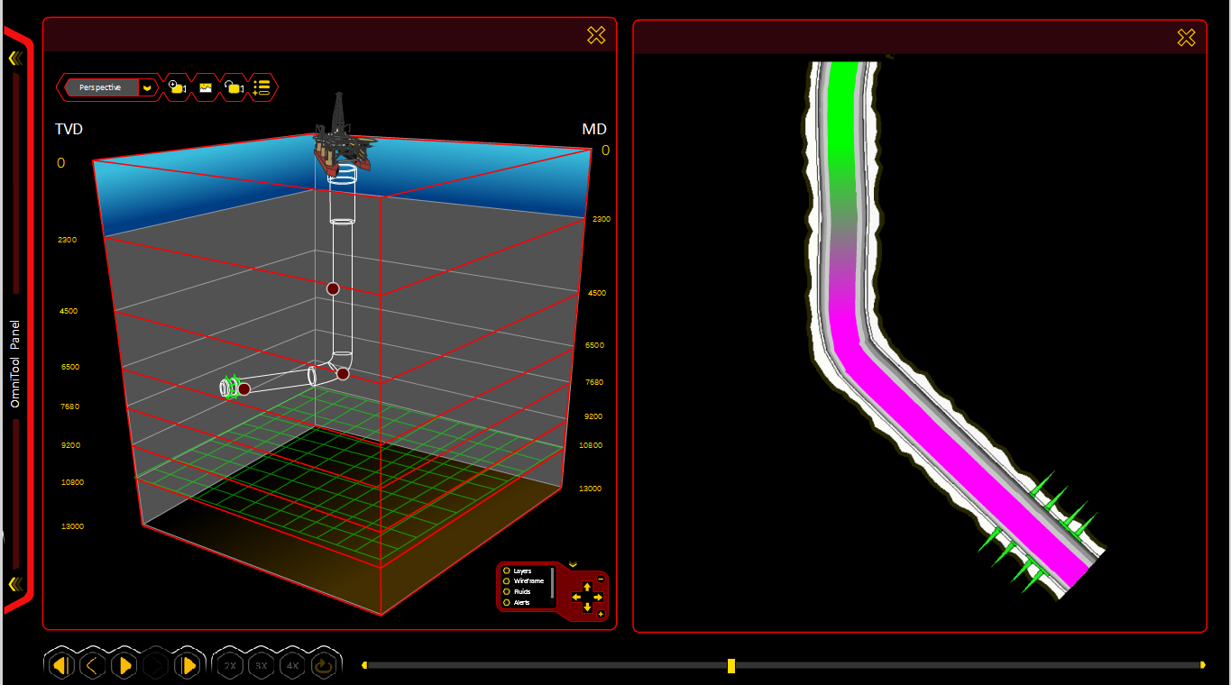
|
| Virtual Fluid Selection and Comparison | Dashboard for Well Bore Damage Notification |
|
|
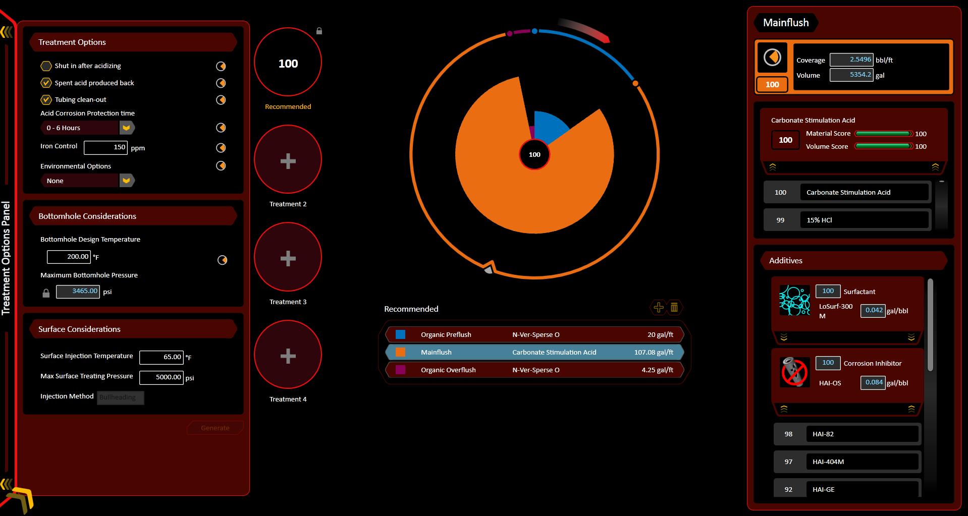
Material Library
This part of the application was dedicated to creating and storing a huge database of chemical mixtures and their properties. A large portion of an engineer’s job was judging which chemical was to be used and with what efficacy. Thanks to the advances in computer modeling, we were able to provide users with a virtual lab that allowed them to mix and measure the properties of new chemicals without actually having to mix the chemicals and waste money. These chemical models could be stored and used by other parts of the application.
|
|
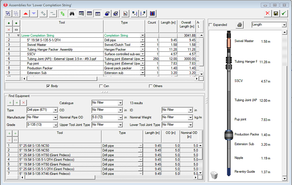
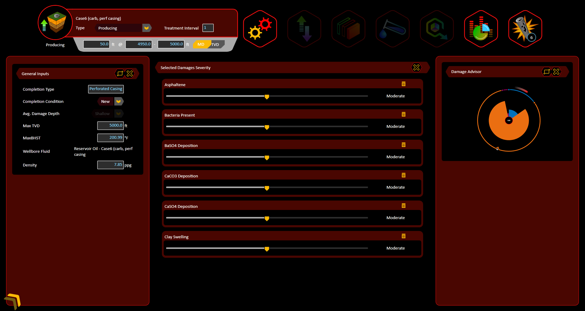
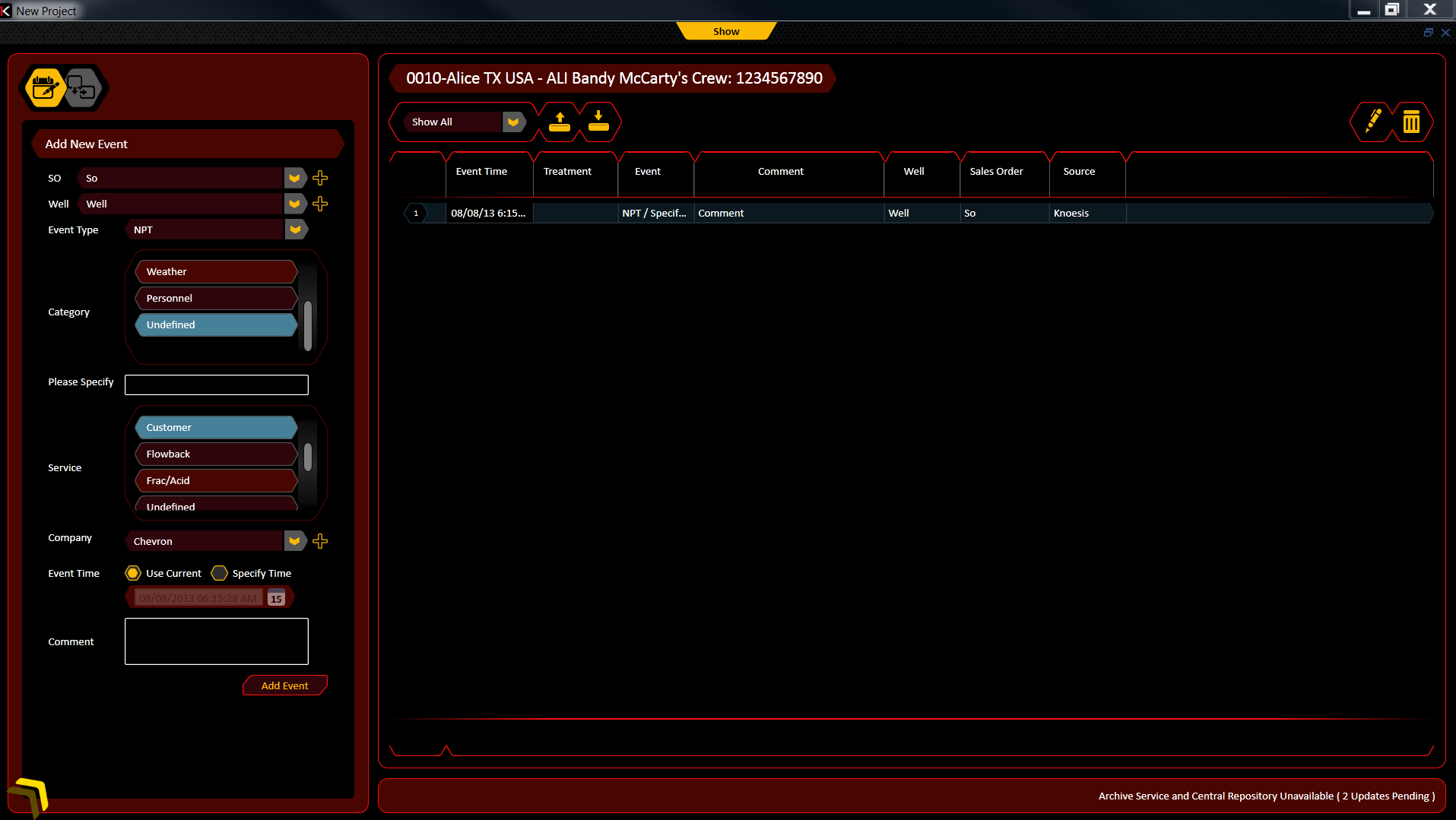
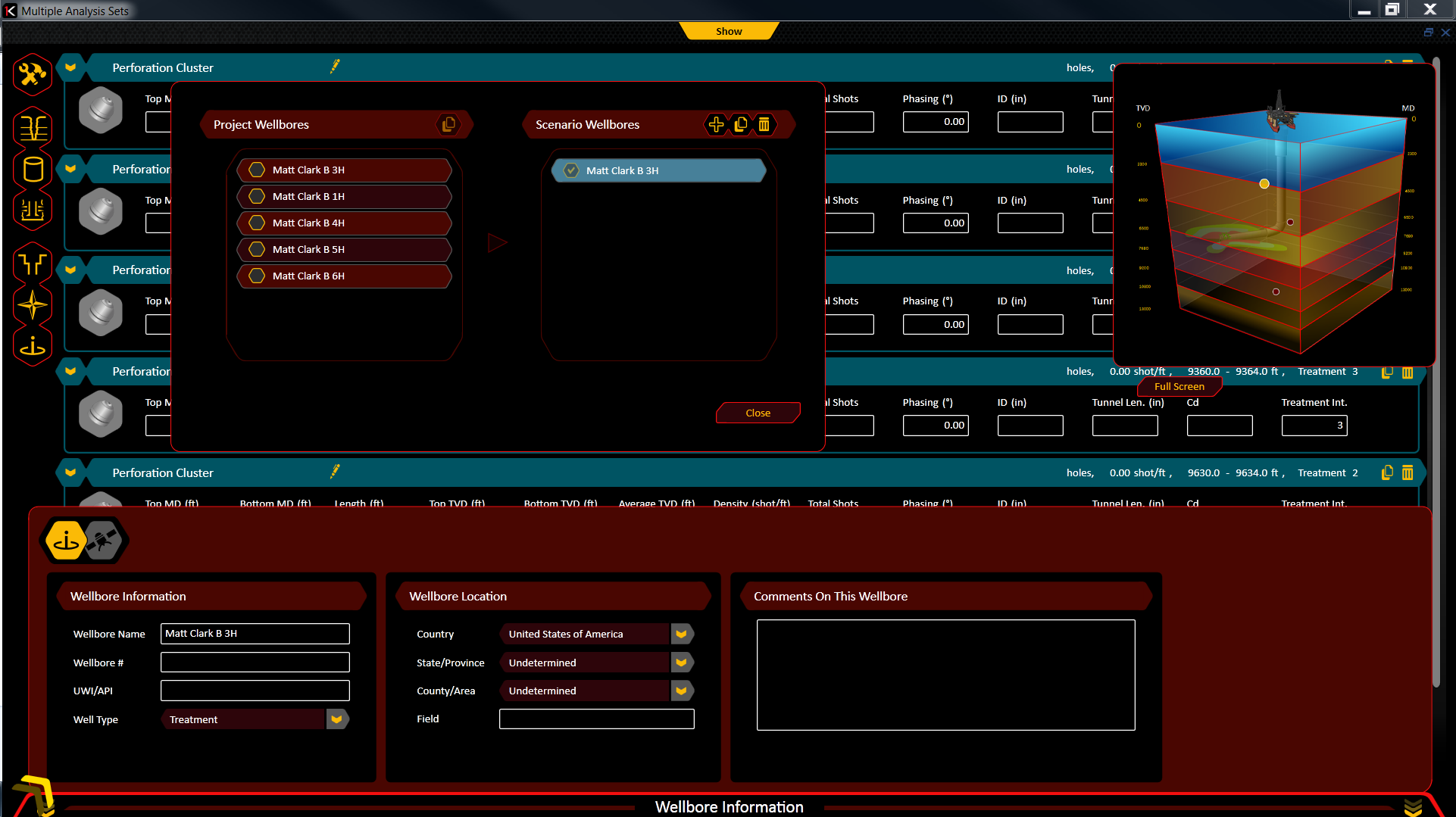
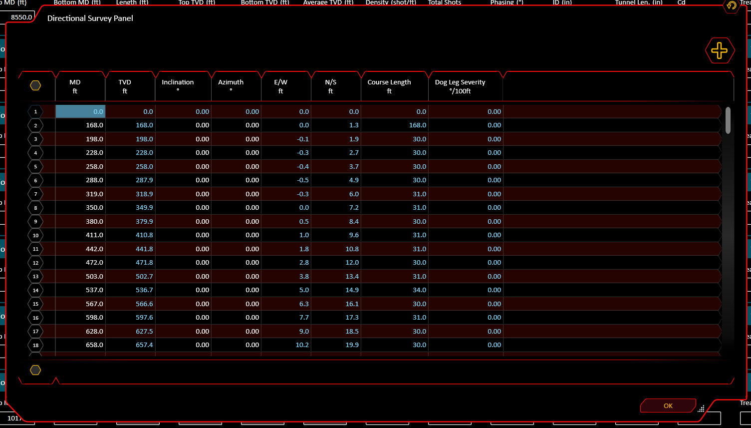
Wellbore
This feature of the suite was dedicated to visualization of the hardware used to create a wellbore. A wellbore was a site where Halliburton has drilled and is either currently extracting fluids from, exploring for fluids, or enhancing an existing sites ability to produce more fluids.
With this tool, engineers could review existing sites to help them determine methodologies needed to improve production. Engineers could also propose drilling configurations based on data from a site, and virtually build and fine-tune the design without having to spend money moving resources to the site, only to not need or need different resources.
| Wellbore Assembly and Customization Tables | Direction Finder |
|---|---|
|
|
Documentation
In order to create good software, you need a good design. In order to build that design, you need to communicate what it does. Documentation is how you meet that need. Our prototype served as a living example, and our written documentation would define the constraints of the product, identify outliers and explain the steps of each task.
This documentation was built in the AGILE cycle. At the end of each sprint, documentation was generated and handed off to the development team and SME’s and PO’s. This document served as the “bible” of the application and would be used to settle Dev, QA and UX questions. This documentation changed as the project changed and had to be managed and updated weekly. Each designer was responsible for making their documents meet ISO compliancy.
Examples
- Material Library Documentation
- 3D Fluid Simulator Documentation
- Wellbore Documentation.
- OmniViewer 3D