Goals
Before we can go into the goals of the project, a little background is needed on where this project was when I came onboard.
A "solution" looking for "a problem to solve.
Initially, when I joined T-Mobile, the project was a "solution looking for a problem." The company had recently acquired the rights to a 3rd party API library that purported to perform a number of tasks, but ultimately proved incapable of many of the promised features. During this time, the company was building features without the aid of UX or any thought about what the use cases would be. There was no clear end goal or "MVP product”. There was no user group to test nor any 3rd party development team that would keep senior staff updated. But, instead, the workforce was replaced every 6 months with newer/greener recruits.
This created problems with "brain drain," building a consistent architecture and design framework, and the ability to enforce any processes. Before we could solve this problem, however, we needed to solve greater problems with product definition.
Design by committee
At first, we were designing for C-level executives and a core group of senior engineers. Though the project was said to run in AGILE, there were no clear work items nor end deliverable goals. Weekly, the entire focus of the project would change based on the whims of executives. There was no attempt to test the ideas against future users of the application nor any long-term vision. Instead, designs would simply have new features added as people thought up new themes. This led to a cluttered user interface with no real identifiable work flows and an excess of CTA’s and icon gems all commanding the same level of attention from the user.
To compound issues, all wireframes needed to be thought out in high-resolution. Despite the fact that screens were changing constantly based on the reasons stated above, there was a demand from executives to see all designs fully realized. Though feature designs are a hand off to stakeholders at this level, it is usually after the challenges of the workflow have been designed, tested and refactored (if necessary). Instead, turnover from idea to full resolution screen was often less than 24 hrs. These screens would be requested. Then if the screen met the needs of the C-level, it was wedged into the application.
This resulted in a sort-of "Frankenstein application." There was no real work flow and little thought put into merging different features of the application into any meaningful flow. Instead, features were almost stand alone and designed without thought of other features or reusable controls and interactions.
| Executive Requests | Engineering Requests | Marketing Request | Resulting Application | |||
|---|---|---|---|---|---|---|
 |
 |
 |
 |
|||
If we were going to have any success in delivering an application that people wanted to use, we needed to institute a workable UX process in the organization and show its effectiveness to the stakeholders. It was also here where it was determined if the API that would drive the feature even worked. Often, it was the case that the feature didn’t work or the requirements handed to UX by C-levels were not vetted to see if the API was capable of performing. This would result in broken features or features removed from a flow that would then break other parts of the application.
Success comes with growth pains
After 8 months of this process, I started to push for some meaningful user testing of the product we had. At the same time, I started to think about the features and APIs that did work and how they could be culled into an MVP feature release. After showing some guerilla testing of features of the application, we performed by building workflows in AXURE as a prototype (then finding people that fit the business personae our team had created to build some sort of identifiable work flow), and the general confusion users had with the main screen and identifying tasks they were given, C-levels took notice. We were allowed to bring in an outside testing company and run a group of users that fit some of the personae we created and get honest feedback.
It wasn't good.
Users faced decision paralysis, or simply failed to complete basic tasks. When asked to perform tasks, users spent too much time looking at a busy screen and randomly pressing buttons, discovering features that should have been intuitive. Other users confused the applications basic function for other applications with completely different features (based on our design requirements from marketing). Now was the time to propose a way out of this problem.
What to do next?
We first needed to understand the complexity of the application being built by development at the behest of executives. I decided to map out the existing application flows so everyone had an idea of what the applciation was doing and the number of choices users had to make in order to accomplish tasks. Few people were aware of what we had built or what we were trying to accomplish. Seeing this interactive guide, helped put that picture into perspective.
During the outside testing, which myself and a few of my team attended, we learned a number of things that would inform our future design. We also took the time to look at successful products in the market place that accomplished features we were trying to match and best. Wwe also needed to get the organization on board with a long term vision for the product and a process.
Process
During the outside testing, which myself and a few of my team attended, we learned a number of things that would reform our future design. We also took the time to look at successful products in the market place that accomplished features we were trying to match and best. We also needed to get the organization on board with a long-term vision for the product and a process.
Culling features for an MVP product
Though user testing would prove disastrous for the original product, it informed our efforts to design the MVP. Prior to testing and during testing, we asked users to tell us what they thought of their current business communications tools and what they liked and didn’t like about them. We learned fairly quickly that 3 things our library of API’s were capable of were things that users were complaining about in their existing solutions.
These findings:
- Users almost universally rejected the dark background. It was considered difficult to read and even harder on the eyes with the company Magenta brand.
- There were excessive buttons and numbers on the screen. And existing solutions suffered from similar issues of offering too much information to the user at once vs gating information into the appropriate places or work flows. Basically, the application was showing too many things at once.
- People were unhappy with how they tracked and responded to coworkers on messages.
- Managing multiple accounts and phone lines on multiple devices was problematic.
- Few people used Contacts sections to initiate communications. Instead they referred more often to recent lists or search.
- Users were accessing 3-4 different applications to call, message and meet with others.
- Tracking and sharing files between coworkers and clients were problematic due to the need to switch between multiple applications.
- People wanted meaningful connections between their contacts, calendar, messages and files.
- People liked products like Skype and Slack, but did not like adopting multiple platforms across multiple contacts or processes. Was there a way to tie this together?
- Initiating new calls, meetings or new messages took too many steps and were isolated from one another.
- People hated managing multiple devices when they had to manage multiple jobs or roles.
For us to succeed, we needed to take this information to heart and find a way to fill the needs of the user. But what were we going to design now?
Based on our findings, and some competitive analysis of what was already in the marketplace, we landed on our MVP feature set. This set would address findings from user testing and market research to fill a gap in existing services and tie together services that were considered stand-alone before.
Our MVP Features:
- Calling, Messaging and Meetings in a single screen
- Easy conversion of a call to a meeting, a meeting to a message, and a message to a calendar event. (And ever other permutation of those flows)
- A virtual SIM implemenationt that allowed users to house multiple telephone numbers on a single device and manage their communications from the same application.
- The ability to treat their MMS or SMS like Slack or Skype
- Simplified new activity work flows
- Enable users to share and track shared documents, files, resources and features across platforms more easily.
We needed to fix systemic problems before we could realise these features.
Identifying problems in the current delivery process
When I joined the project, UX design was treated more like visual design. Engineers would build features then hand them to UX to make visual changes. If the UX designer found issues with the flow or interactions, there was little room for code refactoring. On top of this, screens were handed to development with no documentation or working examples (prototypes.) There was no hand off of designs, and no one served as the point of contact to explain to developers how screens were supposed to flow. This resulted in a number of sprint cycles where designs and results did not match and would fail in testing, or an interpretation of a screen resulted in development that was not intended.
There was no validation process, via user testing or a defined product goal. And there was no single product owner (PO) or defined subject matter experts (SME’s). Before we could move forward, this would have to be addressed.
We also needed to know what our API’s could actually do. This needed a dedicated communication line between myself (UX Platform Lead), the Lead Developer, and a Product owner.
Addressing the issues identified
First, the MVP must be defined. Since I worked on a number of successful AGILE and Scrum driven projects, I offered to help establish the process we would move forward with.
First, the MVP must be defined. Since I worked on a number of successful AGILE and Scrum driven projects, I offered to help establish the process we would move forward with.
Based on what we learned from our user testing and the limitations of our API library, we culled down the unwieldy list of broken and mysterious API’s into a set of features that people wanted and we could deliver on. These features would be designed against identified work flows. These high-level designs (gray scale wireframes) would be tested against a user group and refined, if necessary. Once approved, the design and prototype model would be handed off to a lead developer in a hand-off meeting, with light documentation around error handling, interaction exception and rules governing features designed for that sprint.
The prototype and documentation would then be used by QA to design acceptance tests. This would serve as our documentation moving forward and also create assets that could be socialized through the C-levels and other stakeholders to see intended results in action before they were developed.
To address the issue with turn-over from our 3rd party development team, we instituted a UX-Dev Scrum and a UX-QA Scrum to receive the finished product. During UX-Dev Scrum current issues would be raised and addressed with the incoming design, and this would feed into the full project feature scrums where features were placed in and taken from the backlog for the successive sprints. With the UX-QA scrum we would review the incoming finished work and log bugs against them. These bugs would be linked to the documentation and prototypes for examples.
Instituting these extra meetings for team leads helped train new developers and harness training the exisiting developers after a turn-over to help ramp up these new developers and communicate the expected process. This reduced our bug count from 150+ bugs per sprint to a more manageable 5-10 bugs. Also, the bugs became less about missing the intent of the workflow being developed and more focused on routine bugs and interfacing issues.
Workflows
Eventually, with a process in place and enforced, we were able to move towards developing our product goals. The following screens are a few demonstrations of application flows for the resulting product.
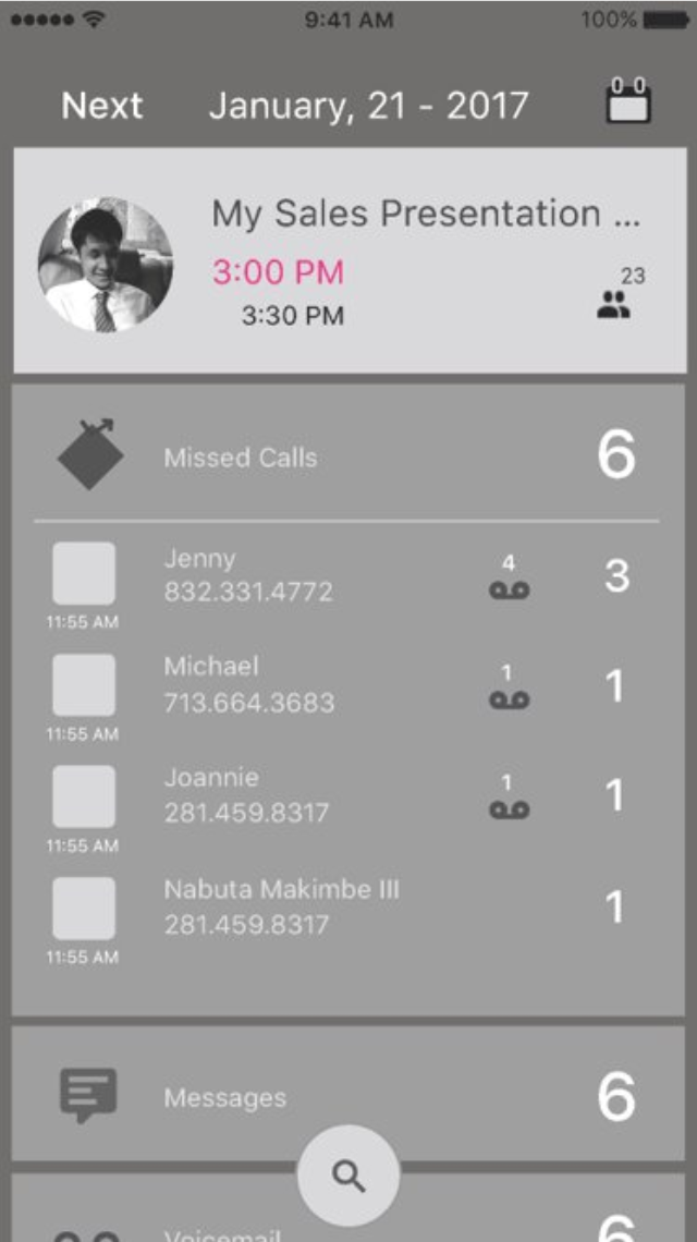
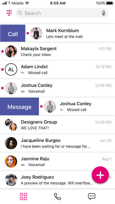
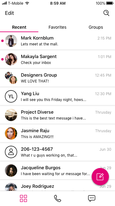
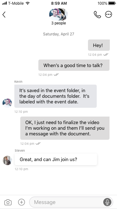
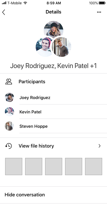
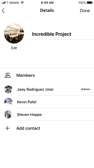
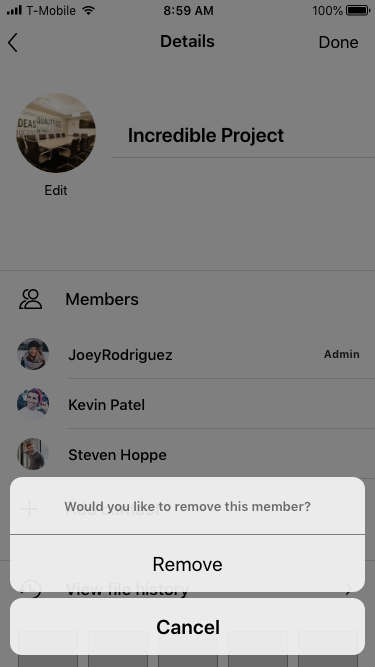
Main Screen
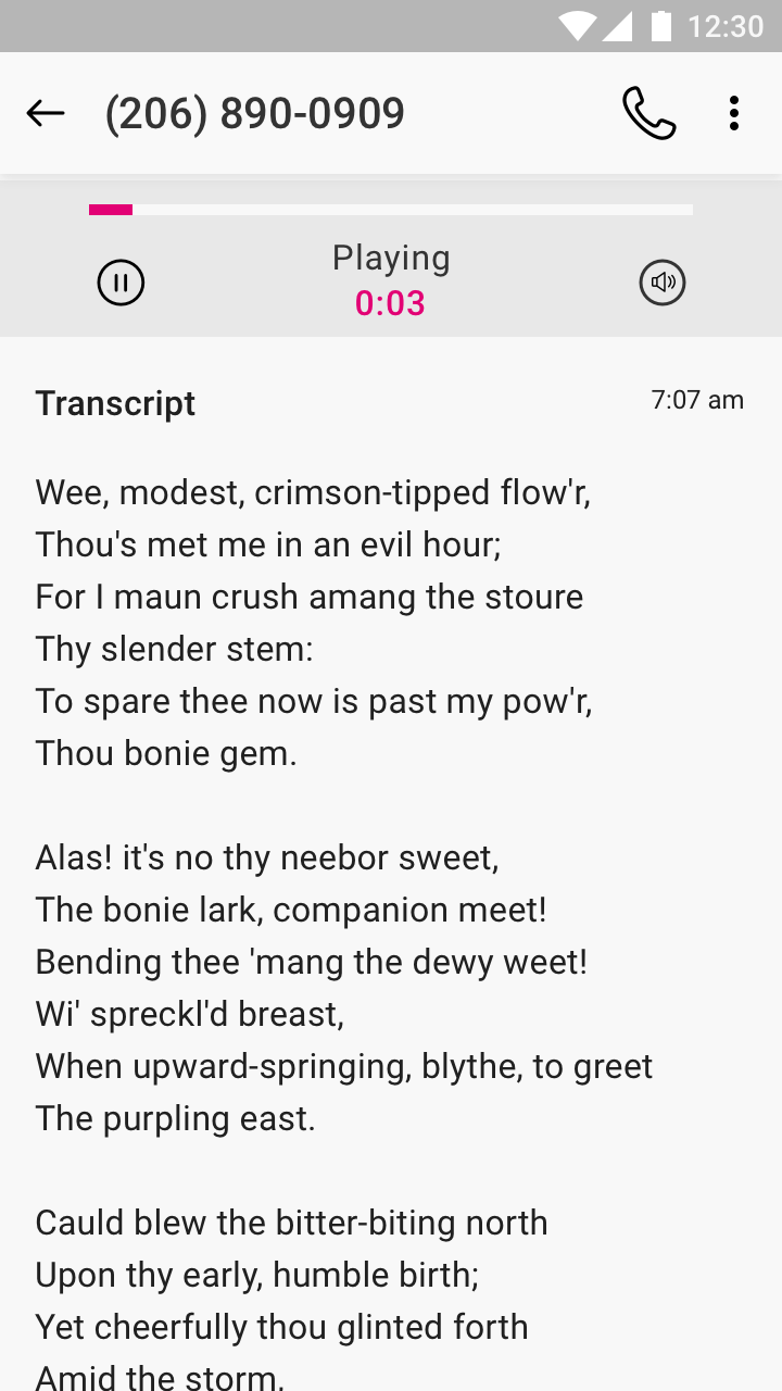
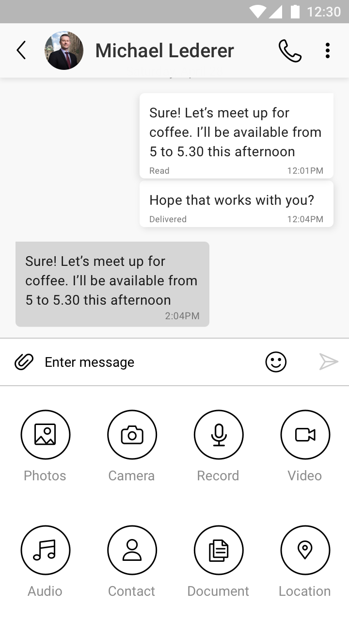
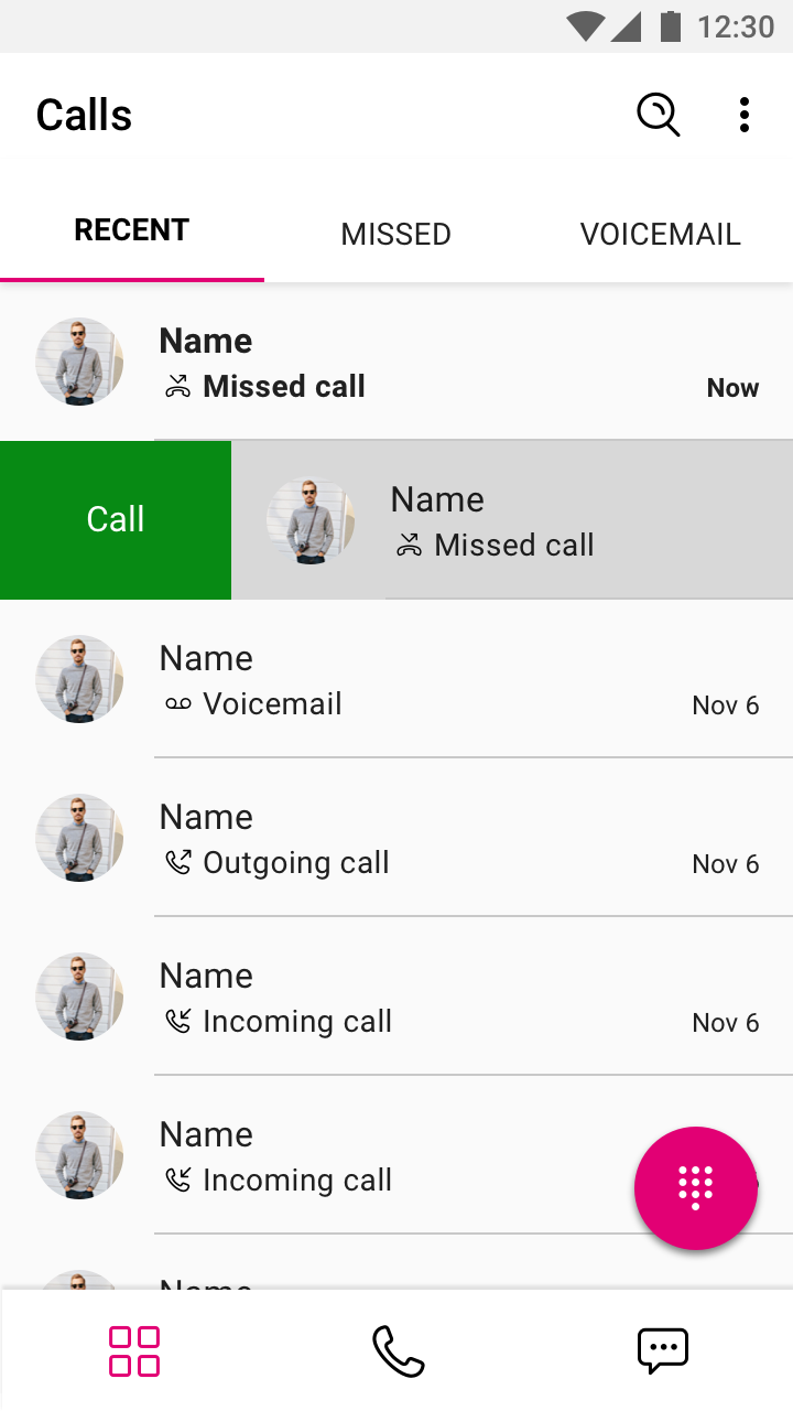
Mixed calling and messaging receipts with multi-response interactions. Users can browse messages, calls and (later) calendar events in a single list view. This list view can be sorted by Recents and Favorites, but defaults to an All state. From this screen, the user can:
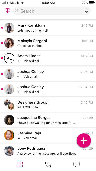
- Return a 1-1 Call
- Respond to a 1-1 message
- Initiate a new 1-1 call
- Initiate a new 1-1 message
- Initiate a message from an existing call
- Initiate a call from an existing message
- Perform all of the above tasks but for groups larger than 1 (+i)
- Search for contacts
- Manage contacts (add/remove/edit)
- Manage groups (add/remove/edit/adminstrate)
- Filter calls by SIM or multiple SIMs simultaneously
- Manage Attachments
- Manage Accounts
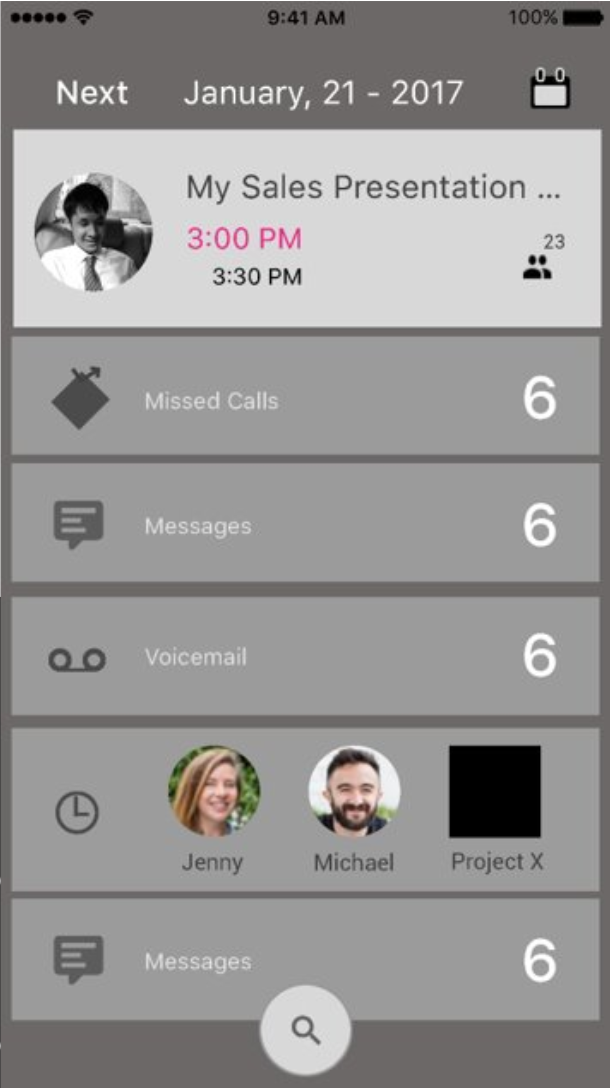
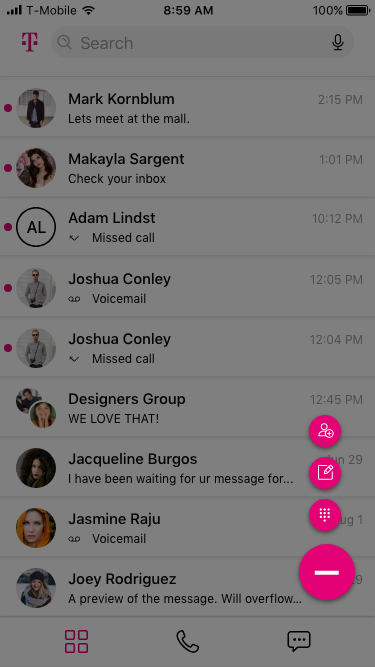
Main Navigation
The 3-Button Navigation is a product of user testing and competitive analysis. Since the initial application was deemed too confusing and the tasks flows ambiguous, I decided to focus on streamlining the user’s choices to the basic tasks of the application. Also, learning through our research and others that users were more likely to access previous contacts in a timeline list or initiate a search for a contact, meant that the need for a Contacts button on the main screen was diminished. In addition, we would now be filtering multiple contact types, communication types and originating accounts in a single screen. The screen needed to focus on ease of access to these tasks and remove distractions that took away from those tasks.
 |
Building a few models and testing them on users, I found that met our target personae, I landed on a 3-button navigation that met those goals and was easily communicated to users. This button navigation worked on the same concept as the recent updates made to Outlook. Though a mail application, Outlook was identified as a similar tool accomplishing similar goals but for a single communication methodology: email. Through their research, Microsoft had also realized that users were more likely to access previous communications or search vs scroll through a list of contacts, and these features were diminished in importance in the information architecture. The user still had access to this list but more likely activity paths were emphasized.
Main Screen States
The Edison application was meant to blend the features of 3 different applications within both Android and IOS and supplement them with an additional Virtual SIM application. Users would be able to access all contact points and types from a single interface that replaced their default calling, messaging and scheduling applications. In the main screen, all communication points were grouped by their receipt or last activity stamp and then users could take direct actions by resuming the communication (calls, messages, meetings), or by engaging in a different form of communication from the previous activity. In other words, one could call a message, message a call and schedule from either activity type.
Here are a few of the many work flows within the application.
| Sliding Menu | Main Default State | Floating Action Button Options | ||
|---|---|---|---|---|
 |
|  |
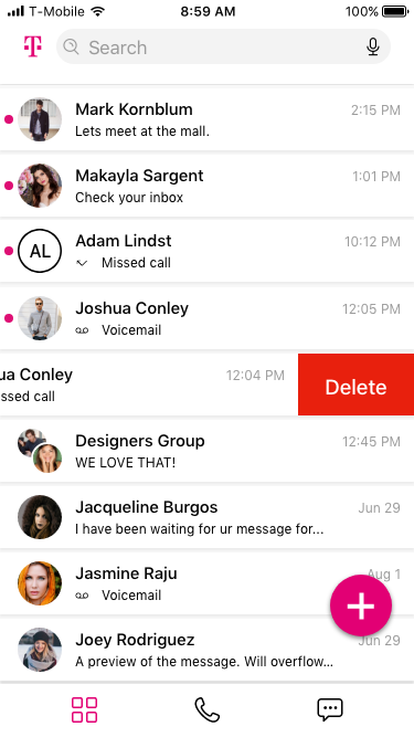
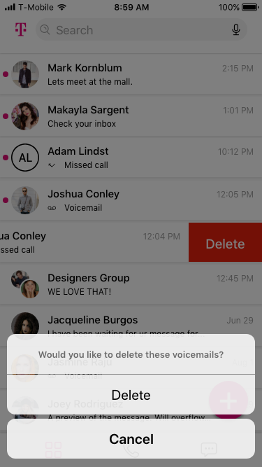
| Contextual Swipe Right Options | Delete Communication Step 1 | Delete Communication Step 2 | ||
|---|---|---|---|---|
 |
 |
 |
||
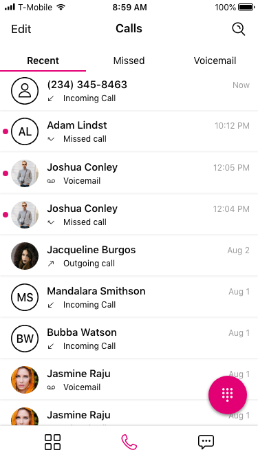
Calling - 3D Touch Details
IOS users had the ability to engage touch interaction that brought up secondary interactions. These were quick actions that users could perform on the contact point.
| Calling Default State | 3D Touch Known Caller | 3D Touch Unknown Caller | ||
|---|---|---|---|---|
|
 |
 |
||
Calling - Multi Select Delete
This is a demonstration of a user selecting and deleting multiple communication types in our IOS version.
| Calling Default State | Enter Multi Select | Select Communications | Delete Communications | |||
|---|---|---|---|---|---|---|
 |
 |
 |
 |
|||
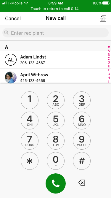
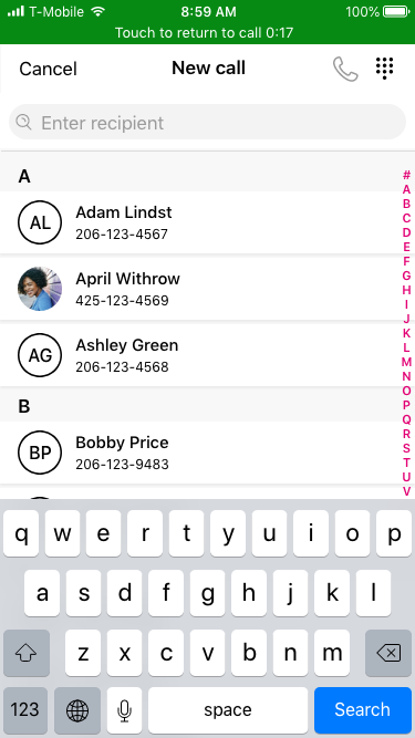
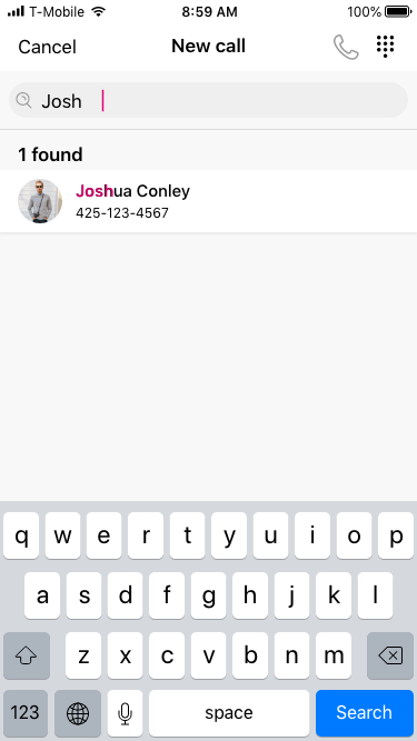
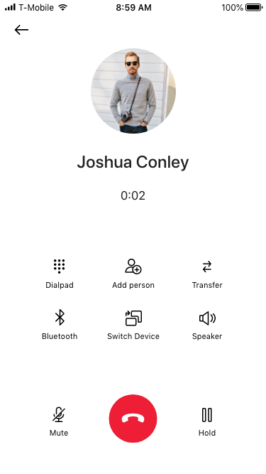
Calling - Initiating New Call
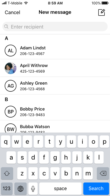
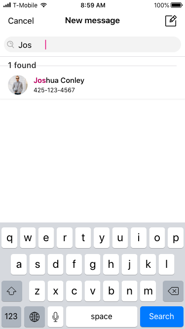
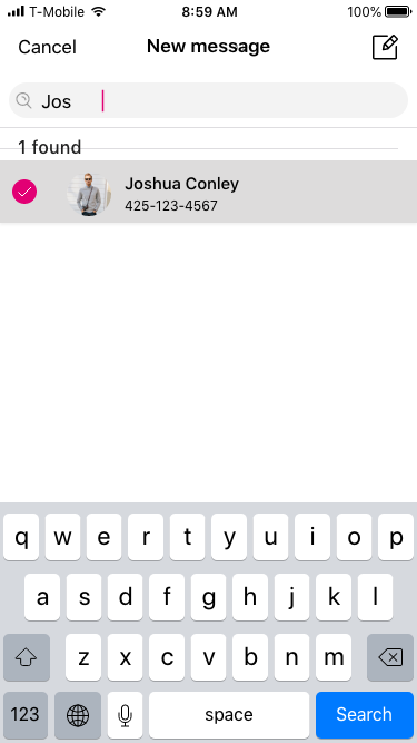
The process designed here would inform our group calling and group messaging work flows designed later and demonstrated after this work flow. Users could search existing contacts, messages, calls, meetings and other sources that have passed through the application for methods to contact others. Through a "Super Search" they could then initiate new communications with them or return to existing communications.
In this demonstration we are searching for a contact and initiating a new call.
| Press Call FAB | Numberpad Default | Keypad Option | Search Initiated | |||
|---|---|---|---|---|---|---|
|
 |
 |
 |
|||
| User Selects Option | Call Attempts Connection | Call Successful | Call Ends | |||
 |
 |
 |
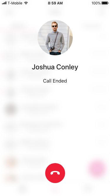 |
|||
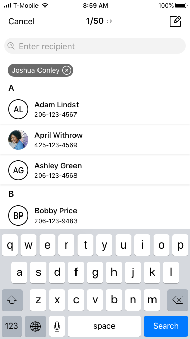
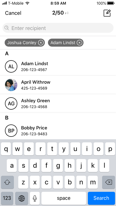
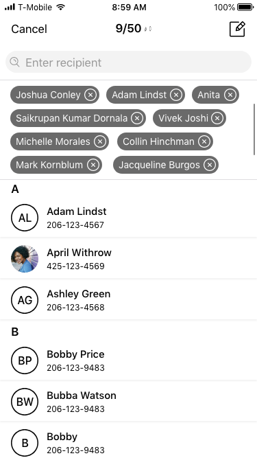
Creating a New Group Message
From the workflow for initiating calls and messages with individuals, we then built our methodology for adding more than one person to either activity type. In this demonstration we search and add users individually or in groups of contacts we created for ease of access. From these searches we can stack up to 25 users to add to a group message or call. If all of the users of the application are users of Edison, we are granted even more features and administrative abilities that turn MMS type communications into a Slack or Skype like threaded chat platform.
| Press MessageFAB | Keypad Default | Search Initiated | Selection Mid Search | |||
|---|---|---|---|---|---|---|
 |
 |
 |
 |
|||
| Attendee Added | Second Attendee Added after Search | Multiple Attendees Added | Group Message Initiated | |||
 |
 |
 |
 |
|||
| View Group Details | Viewing Open Group Details | Administrating Attendees | Removing Attendees | |||
 |
 |
|
 |
|||
Screenshots
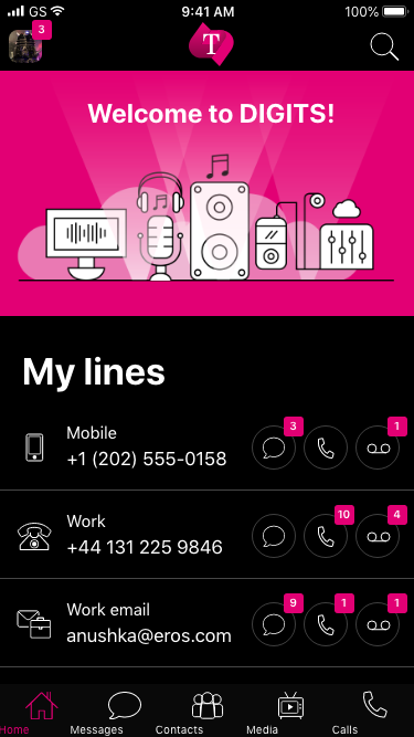
The following are screenshots from various projects I worked on while a platform lead for mobile business applications. Some of these were proof of concept models while others eventually went into production. Before the inception of Edison, many of the features were designed and built in a prior product (mentioned above) known as DIGITS.
Ipad DIGITS Conferencing
| Digits Schedule Conference | Digits Conference Attendees List View | Digits Settings Main | Digits Media Browser |
|---|---|---|---|
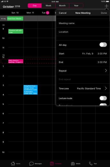 |
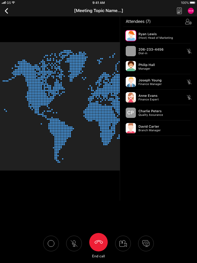 |
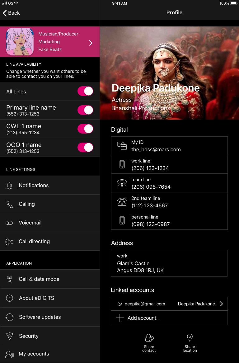 |
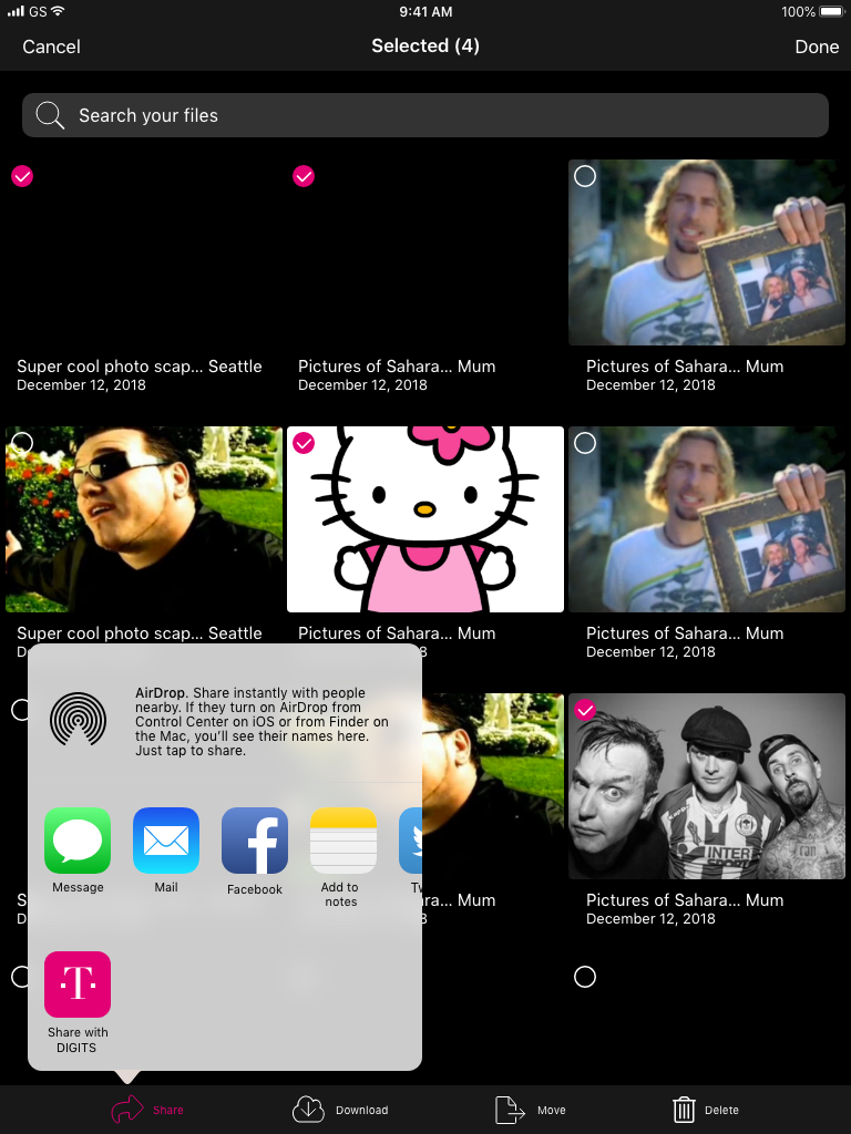 |
Android Screen Shots from Edison and DIGITS
| Edison Voicemail Screen | Edison Message Screen | Edison Calling Main | DIGITS Conferencing | |||
|---|---|---|---|---|---|---|
 |
 |
 |
 |
|||
Prototypes
In order to achieve success, we leaned heavily on prototyping to illustrate ideas and serve as documentation for both the developers and quality assurance testers. Since I was the one most familiar with variable driven prototyping, I took the lead on this process. It was through my efforts to create a realistic model of the application, that we were able to realize the product goal. Eventually, Marketing would use my model in order to sell the product up the management chain. Being able to put a working model in their hands created more buy-in.
Below are some of those prototypes, illustrating everything from workflows to actual models of the software that could be run on Android and IOS devices. They have been framed to replicate your phone. Some fonts may not render on your browser. These files are best demonstrated with the Axure App, which I am happy to do in person.